
Some folks from
Solar Vehicle and the Carlson School had lunch at Caterpillar (CAT) today. It was pretty impressive, considering we got a tour of the factory where they make 90,000 lb pavers one at a time. Equally impressive was the enthusiasm that went in to the design, manufacture, and marketing of those pavers. Our contacts at CAT were eager to tell us about their operations, show us things like half-inch steel plate being cold-rolled into compactor drums, and take group pictures in front of the rotary mixers. They wore their CAT loyalty on their sleeves, and allowed us to do the same by sending us home with some hats and die-cast models (very generous of them, and a nice addition to my collection of yellow vehicle models which includes other CAT pavers).
As a graphic designer, the fact that the corporation even has merchandise related to their product is intriguing. Besides being ridiculously good at what they do, CAT has developed a highly visible and consistent brand image that allows their employees and enthusiasts (yes, this paving equipment company has fans) to demonstrate the loyalty that is instilled by an engaging work environment and a superior product.
And, being a graphic designer, I have a lot of brand loyalties of my own based on both product quality and brand image. CAT is definitely one of them, considering their contributions to the solar car team, their "hometown" appeal, and their reputation as a quality engineering and production entity. For kicks, here's a short list of some of my other favorite brands.
 MINI Cooper
 - Taking a historical icon into the present is difficult enough, but making the reimagined product an icon in its own right is quite the achievement. BMW, another high-visibility brand, was probably the best positioned to take on the task of maintaining the brand image of the endearingly diminuitive car. They produced a stylish and functional homage, and though their recent modifications to the line depart from the classic brand concept in ways I'm not quite sure I like (the
MINI Beachcomber unveiled at the Detroit Auto Show can only be described as gimmicky), it can it least be said that they've got the guts to try and implement the innovation of an icon. Plus, any graphic designer worth their salt is probably desperately in love with their cheeky,
minimalist design scheme.
 Pepsi
Pepsi - There's really no matching the merchandising volume of Coca-Cola, whose brand image has retained value throughout its lifespan and in all its incarnations. Heck, Coke pretty much owns the idea of Santa these days; it's hard for a brand image to get more ubiquitous. But the saying goes "quality over quantity," and Pepsi has quality in spades when it comes to both product and image. Neglecting their under-represented sector in the energy drink market (we'll consider Amp a separate brand), they have held strong against decades of Coke supremacy and have underdog appeal with big dog market presence. Their recent brand re-imaging could have gone better (their Pepsi logo has been likened to a
fat dude), but whatever they lost in awkward vector graphics and glaring comparisons with the Obama campaign, they made up for with their Throwback initiatives. At least the stylishly retro
first attempt.
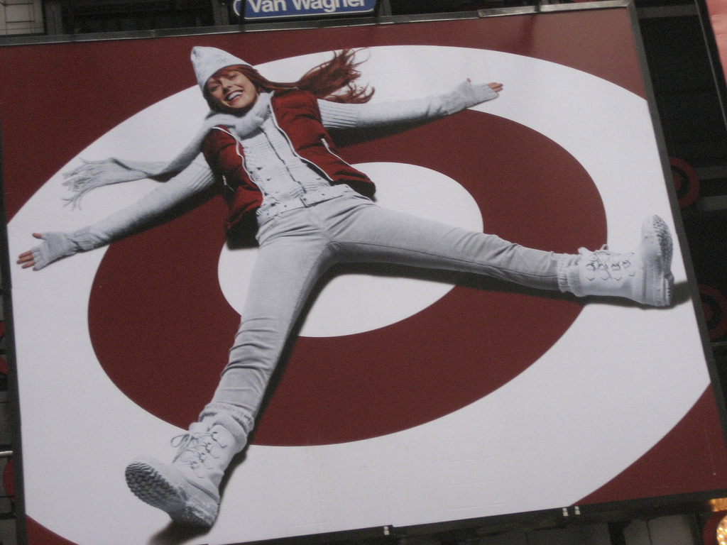
 Target
 - Like CAT, this large corporation has local appeal. The brand is so much a part of the character of Minneapolis that both our pro basketball arena/event center and now our baseball field bear its name. In addition, the brand seems to be so much a part of the character of the country that the bullseye logo has been reported as one of the most recognized in the design industry; Target often forgoing their name in
recent advertising efforts because their brand recognition can be assured with even such minimal cues as their color scheme. Honestly, you can't even wear khakis and red together anymore unless you want someone to ask you which aisle cereal is in. Besides their undeniable presence, Target's PR positioning as a more upscale alternative to their major competitors (Walmart, KMart), with big-name designers contributing budget product lines, gives the Target brand an edge with would-be followers... let's face it, the only people who will ever wear that garish yellow smiley as a
badge of identity will be the octogenarian greeters in blue vests.
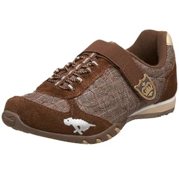
 Rocket Dogs
 - Okay, so their image isn't exactly plastered everywhere you go. And since their logo is a purple and orange canine eyesore, this is probably a good thing. But I just can't get enough of their sturdy
sneakers (they resist fraying and sole wear even longer than Converse I've owned) and quirky name. Is the
Converse brand more recongizable, and rightfully so (so much so that I modeled my "All Stars Roller Girls" roller skate design on them)? Yeah. But at least in my opinion, their overly-narrow sneakers and their limitation to essentially three designs in four hundred colors leaves something to be desired. I wouldn't wear that obnoxious indigo dog on my sleeve... but I certainly don't mind wearing a
nondescript version on my shoes.
 Rocket Dogs - Okay, so their image isn't exactly plastered everywhere you go. And since their logo is a purple and orange canine eyesore, this is probably a good thing. But I just can't get enough of their sturdy sneakers (they resist fraying and sole wear even longer than Converse I've owned) and quirky name. Is the Converse brand more recongizable, and rightfully so (so much so that I modeled my "All Stars Roller Girls" roller skate design on them)? Yeah. But at least in my opinion, their overly-narrow sneakers and their limitation to essentially three designs in four hundred colors leaves something to be desired. I wouldn't wear that obnoxious indigo dog on my sleeve... but I certainly don't mind wearing a nondescript version on my shoes.